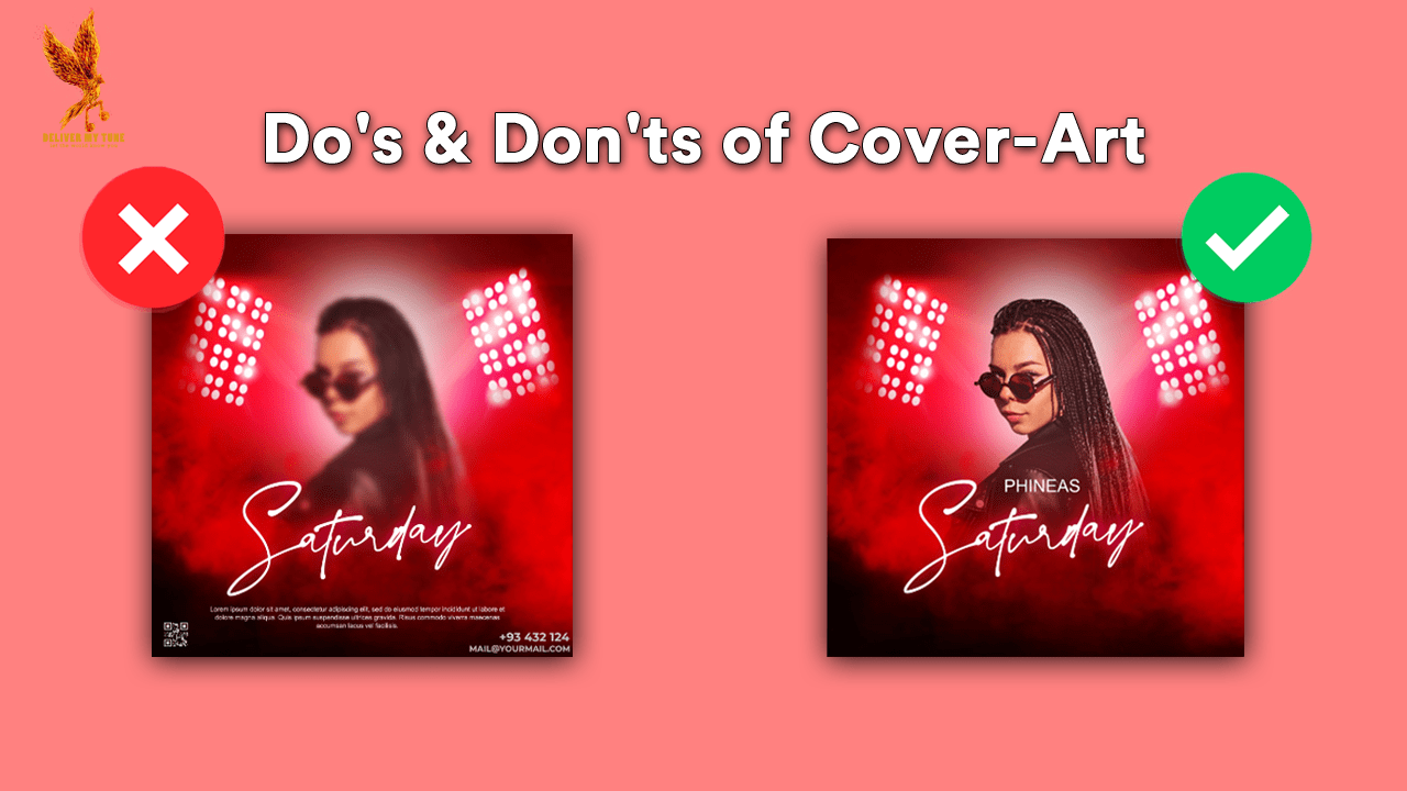
Cover art of song is more than just an aesthetic choice; it serves as the visual front line of your music’s digital presence. In an era where digital shelves are crowded and competition is fierce, the right cover art can set your song apart, while mistakes in its design can lead to lower visibility or even distribution rejection. This guide dives deep into what not to do when designing your song’s cover art, backed by industry standards and effective marketing practices.
The Importance of Cover Art of a Song in Music Distribution
Cover art is the first interaction listeners have with your music on digital platforms. It not only needs to capture the essence of the song but also comply with specific platform guidelines to avoid rejection. Effective cover art translates into better engagement, more streams, and successful branding.
Common Mistakes to Avoid in Cover Art Design of a Song
Overcomplicating the Design
Simplicity Is Key: Cover art should be visually striking but not overly complicated. Complex designs can confuse potential listeners and fail to convey the intended message. Simple, clean designs work best, especially given the small display sizes on streaming platforms.
Using Low-Quality Images
Importance of High Resolution: Always use high-resolution images for your cover art. Low-quality, pixelated images are often rejected by digital distribution platforms and can make your work appear unprofessional.
Ignoring Copyright Laws in a Cover Art of a Song
Legal Implications: Never use images or elements that are not licensed or owned by you. Copyright infringement can lead to legal issues and immediate rejection from digital platforms. Always ensure you have the right to use the imagery in your cover art.
Including Too Much Text
Visual Focus: While some text is necessary, like the artist name and song title, too much can clutter the design and detract from the main visual elements. Keep text minimal and legible.
Misrepresenting the Song Content
Visual and Audio Alignment: Ensure your cover art reflects the mood and genre of your music. Misleading cover art can create a disconnect between what listeners expect and what they hear, potentially leading to dissatisfaction and lost interest.
Technical Requirements for Digital Distribution
Resolution and Format: Cover art must meet specific technical criteria to be accepted on most platforms. Typically, this includes a resolution of at least 3000×3000 pixels in a square format, saved as a JPEG or PNG file.
Platform-Specific Guidelines: Different platforms may have their own set of requirements or prohibitions, such as no explicit content or branded logos. Familiarize yourself with these guidelines before finalizing your cover art.
Designing Cover Art of a Song That Sells
Understand Your Audience
Knowing your target audience can significantly influence the design process. Design with the listener in mind—what appeals to them visually will likely catch their attention in a streaming lineup.
Consistency Across Branding
Your cover art should align with your overall artistic brand. Consistent use of colors, fonts, and style helps in building a recognizable brand that listeners can identify across various platforms.
Professional Tools and Assistance
Consider using professional design software or hiring a graphic designer to ensure your cover art is up to industry standards. Professional designers can provide creative insights and technical expertise that elevate your song’s visual representation.
Conclusion
Cover art, often a listener’s first impression of your music, plays a crucial role in the success of your song’s digital distribution. Avoiding the common pitfalls discussed can prevent distribution rejections and align your visuals with your music’s quality and brand. By investing the necessary effort into creating compelling and compliant cover art, you ensure that your music not only reaches but resonates with your intended audience.
For additional resources on music marketing and distribution, visit Deliver My Tune.

