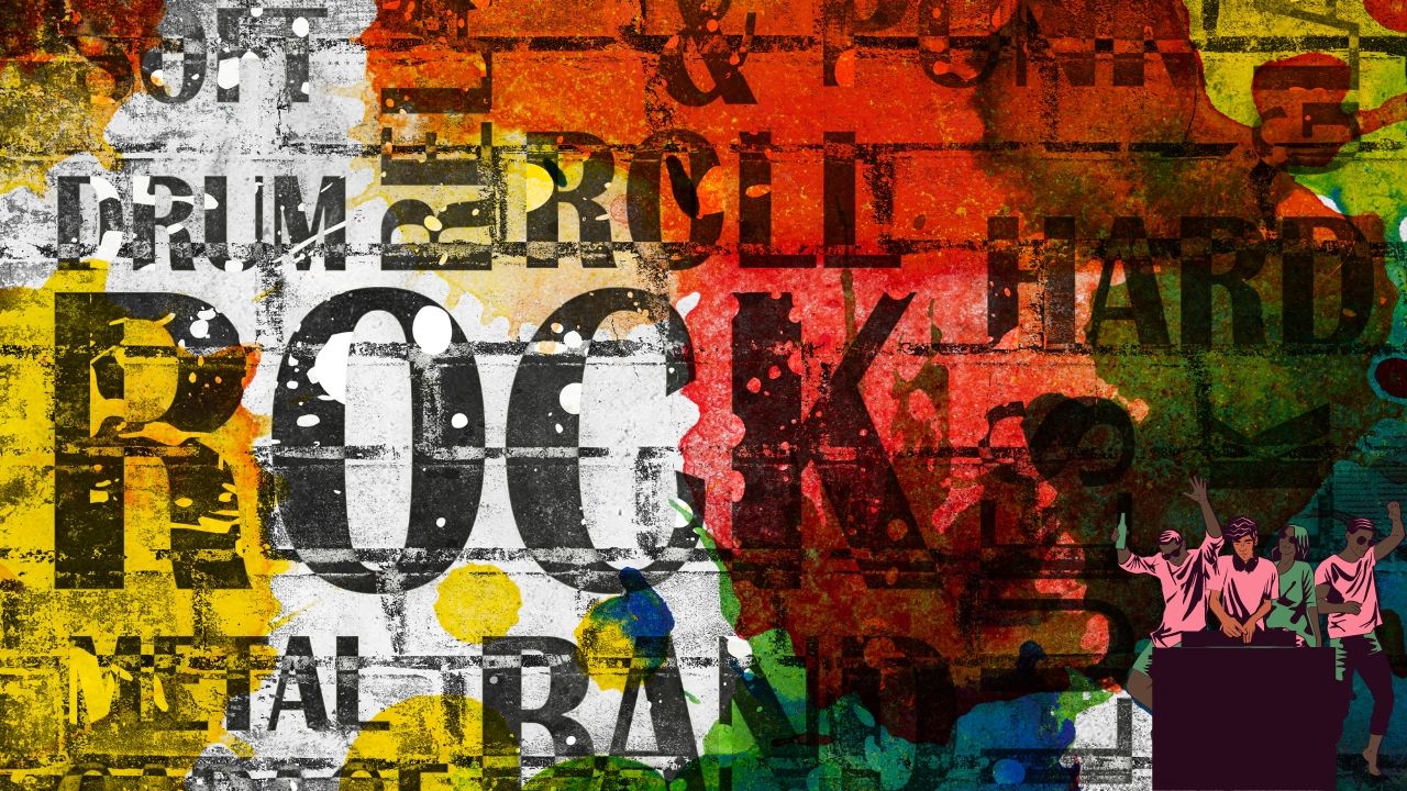
Creating a music festival poster is an exciting but challenging task. It’s more than just putting together a few graphics and some text—it’s about capturing the essence of your event and communicating it effectively to your target audience. Whether you’re organizing a small local gig or a massive festival, your poster is often the first point of contact between your event and potential attendees. In this detailed guide, we will walk you through everything you need to know to create a music festival poster that stands out and drives interest.
The Role of a Music Festival Poster
Understanding the role your music festival poster plays is crucial. This isn’t just a piece of decoration—it’s a powerful marketing tool. The poster needs to achieve the following objectives:
- Attract Attention: The poster should be eye-catching and stand out from other promotional materials.
- Communicate Information: It must clearly convey the essential details like the event name, date, venue, and lineup.
- Reflect the Festival’s Character: The design should mirror the festival’s atmosphere, whether it’s a laid-back folk festival or a high-energy EDM event.
Step 1: Identifying Your Core Message
Before you begin the design process, it’s important to nail down the core message of your music festival poster. What is the one thing you want people to remember about your event after seeing the poster? Is it the incredible lineup, the unique location, or the overall vibe? Identifying this key message will guide all your design decisions as you create a music festival poster.
Know Your Audience
Understanding your audience is key to creating an effective music festival poster. Consider the demographics of your target audience:
- Age Group: Younger audiences might appreciate bolder, more modern designs, while an older crowd might prefer something more classic or understated.
- Music Preferences: The poster should align with the genre of music featured at the festival. For instance, a jazz festival might have a more elegant and timeless design, while a punk rock festival could have a more gritty and raw aesthetic.
Crafting a Compelling Message
Your poster’s message should be simple yet compelling. It could be something like “The Ultimate Summer Experience” or “A Night of Unforgettable Music.” Whatever it is, it should resonate with your audience and make them want to be a part of the event. This clarity of message will ensure that when you create a music festival poster, it will effectively draw in the audience.
Step 2: Selecting the Perfect Color Scheme
Colors are one of the most powerful tools in a designer’s arsenal. The colors you choose for your music festival poster will set the tone and mood for the event. Here are some tips for choosing the right colors:
- Match the Theme: The colors should align with the festival’s theme. For example, a festival in the mountains might use earthy tones like greens and browns, while a beach festival could use blues and sandy hues.
- Psychology of Colors: Different colors evoke different emotions. Red can create a sense of urgency and excitement, while blue is calming and trustworthy. Think about the emotion you want your festival to convey as you create a music festival poster.
How to Choose a Color Palette
Start by picking a dominant color that represents the festival’s theme. Then, select complementary colors that work well together. Tools like Adobe Color can help you create a harmonious color palette.
Examples of Effective Color Schemes
For a reggae festival, you might choose green, yellow, and red, reflecting the Rastafarian flag. For a festival focusing on indie music, you could opt for pastels and muted tones to convey a more relaxed, artistic vibe.
Step 3: Choosing the Right Fonts
Fonts are more than just a way to display text—they are a critical part of your music festival poster’s design. The right font can convey the personality of the festival and make your poster more engaging. When you create a music festival poster, selecting the appropriate typography is crucial to ensure that the poster resonates with your audience.
Font Selection Tips
- Headline Font: Choose a bold, distinctive font for the festival name. This is the first thing people will notice, so it needs to be eye-catching.
- Body Font: The body text should be clear and easy to read. Sans-serif fonts like Arial or Helvetica work well for readability.
- Font Pairing: Use no more than two or three fonts. Pairing a decorative font with a simpler one often works well. For example, you might use a hand-drawn font for the headline and a clean, sans-serif font for the details.
Typography and Branding
The typography should be consistent with the festival’s overall branding. If your festival already has a brand guide, make sure the fonts you use align with it. Consistency across all marketing materials is key to building a strong brand identity. This consistency is critical when you create a music festival poster that aligns with the broader marketing strategy.
Step 4: Utilizing Imagery Effectively
Imagery is one of the most effective ways to grab attention and convey the vibe of your festival. Whether it’s photos, illustrations, or abstract designs, the imagery you choose should be high-quality and relevant to the event. As you create a music festival poster, selecting the right imagery can significantly impact the effectiveness of your promotional efforts.
Choosing the Right Images
When selecting images, consider the following:
- Relevance: The image should be directly related to the event. If it’s a rock festival, images of electric guitars or bands performing on stage would be appropriate.
- Quality: Always use high-resolution images. Pixelated or blurry images can make your poster look unprofessional.
- Balance: The image should complement the text, not overwhelm it. Ensure that the visual and textual elements of your poster are well-balanced.
Creative Imagery Ideas
For a more artistic festival, you might consider using abstract designs or illustrations that reflect the festival’s creative spirit. For example, a festival celebrating world music could use imagery that incorporates global symbols or patterns, helping you create a music festival poster that truly stands out.
Step 5: Establishing a Visual Hierarchy
A strong music festival poster guides the viewer’s eye from the most important information to the least. This is achieved through visual hierarchy, where the most crucial details are the most prominent. When you create a music festival poster, understanding and implementing visual hierarchy ensures that your audience absorbs the key information quickly and effectively.
Elements of Visual Hierarchy
- Size: The largest text should be the festival’s name, followed by the date, location, and lineup.
- Color: Use contrasting colors to highlight key information. For example, if your background is dark, use a light color for the text.
- Positioning: Place the most important information at the top or center of the poster. People naturally look at these areas first.
Examples of Good Visual Hierarchy
For a large festival, the lineup might be a major selling point. In this case, consider placing the headlining acts prominently in the center of the poster, with supporting acts listed below in smaller text. This method ensures that when you create a music festival poster, the most critical information stands out, guiding the viewer through the content smoothly.
Step 6: Incorporating Essential Information
Your music festival poster must include all the essential details about the event. This information needs to be clear and easy to find. As you create a music festival poster, ensure that the layout is functional and aesthetically pleasing.
What to Include
- Event Name: This is the focal point of the poster and should be the most prominent feature.
- Date and Time: Ensure this is clearly displayed. Use a bold font or color to make it stand out.
- Location: Include the venue name and address. If the festival is in a well-known area, you might also include a small map or landmark.
- Lineup: List the main acts prominently. If space allows, include the supporting artists as well.
- Ticket Information: Tell people where and how they can purchase tickets. You might also include a QR code for easy access to the ticketing site.
- Social Media and Website Links: Make sure to include links to the festival’s website and social media pages for more information.
Avoiding Information Overload
While it’s important to include all the necessary details, avoid cluttering the poster with too much text. Keep the design clean and make sure there’s enough white space to allow the design elements to breathe. This balance is key when you create a music festival poster that is both informative and visually appealing.
Step 7: Aligning with Your Festival’s Branding
Consistency is key when it comes to branding. Your music festival poster should align with the overall branding of your event. This includes using the same colors, fonts, and imagery style across all promotional materials. This alignment ensures that when you create a music festival poster, it reinforces your festival’s brand identity and aids in recognition.
Importance of Consistent Branding
Consistent branding helps build recognition and trust with your audience. When people see your poster, they should immediately associate it with your festival. If your festival has a logo, be sure to include it in a prominent position on the poster.
Extending Branding Across Platforms
Ensure that the branding used in your music festival poster is also reflected in your online presence, such as your website, social media profiles, and email newsletters. This creates a unified and professional image for your festival. Consistent branding across all platforms helps build familiarity and trust with your audience, making your promotional efforts more effective. When you create a music festival poster, consider how the design will translate to other marketing materials to maintain this consistency.
Step 8: Creating a Compelling Call to Action
Every music festival poster should have a clear and compelling call to action (CTA). The CTA is what drives people to take the next step, whether that’s buying tickets, visiting the website, or following the festival on social media. A well-crafted CTA can significantly boost engagement and conversion rates.
Crafting an Effective CTA
Your CTA should be:
- Visible: Place it in a prominent position, such as at the bottom of the poster.
- Urgent: Use language that encourages immediate action, such as “Get Your Tickets Now” or “Don’t Miss Out!”
- Aligned with the Event’s Tone: Ensure the tone of the CTA matches the overall vibe of the festival. A casual festival might use a fun, laid-back CTA, while a more formal event might opt for something straightforward.
CTA Placement and Design
The CTA should stand out from the rest of the poster. Consider using a contrasting color or placing the CTA within a distinct shape, such as a button or banner, to make it stand out. Ensure the text is large enough to be read from a distance, particularly if your poster will be displayed in public spaces. When you create a music festival poster, the effectiveness of your CTA can make a significant difference in your ticket sales and overall event success.
Examples of Effective CTAs
- “Buy Tickets Now and Save 20%”: Encourages urgency by offering a discount.
- “Join the Party! Tickets Available Here”: Conveys a fun, inclusive vibe.
- “Limited Seats—Book Your Spot Today!”: Creates a sense of exclusivity and urgency.
Step 9: Adapting Your Poster for Different Formats
As you finalize your music festival poster, it’s crucial to think about how it will be distributed. Will it be printed, shared online, or both? Each format has different requirements, and adapting your design accordingly ensures your poster looks great no matter where it’s seen. This adaptability is important when you create a music festival poster that needs to reach a wide audience across various platforms.
Printing Your Poster
When printing your music festival poster, ensure it’s in a high-resolution format (at least 300 DPI) to avoid any pixelation. You might need to adjust the dimensions based on where the posters will be displayed. Standard poster sizes include:
- 11″ x 17″: Ideal for smaller venues or community boards.
- 18″ x 24″: A common size for larger promotional displays.
- 24″ x 36″: Perfect for billboards or large indoor displays.
Preparing Digital Versions
For online distribution, you’ll need a digital version of your music festival poster. Ensure the file size is optimized for quick loading, especially if you’re posting on social media or your website. Here are some tips for digital adaptations:
- Social Media: Create versions of your poster tailored to specific platforms. For instance, Instagram’s square format might require some cropping or rearranging of elements.
- Website Banners: If you plan to use the poster as a banner on your website, ensure it’s in the appropriate dimensions (e.g., 1200 x 628 pixels for a Facebook ad).
- Email Newsletters: Include a smaller version of the poster in email newsletters, linking it to your ticket sales page or festival website.
Consider creating an animated version of your poster for platforms like Instagram Stories or Facebook Ads. Simple animations—like text fading in, or images sliding into place—can capture attention and engage viewers more effectively than a static image. This dynamic approach can help you create a music festival poster that stands out in crowded digital spaces.
Step 10: Testing Your Poster’s Effectiveness
Once you’ve designed your music festival poster and adapted it for different formats, it’s time to test its effectiveness. Testing allows you to gather feedback and make any necessary adjustments before rolling out your poster campaign on a larger scale.
Gathering Feedback
Share your poster with a small group of people who represent your target audience. Ask them specific questions such as:
- Does the poster catch your eye?
- Is the essential information clear?
- Does the design reflect the festival’s vibe?
- Would this poster make you want to attend the festival?
Based on the feedback, you might need to tweak the design, such as making the event date more prominent, adjusting the color scheme, or revising the CTA. This iterative process ensures that when you create a music festival poster, it will be as effective as possible in reaching and engaging your audience.
A/B Testing for Digital Posters
If you’re using your poster in digital ads or on social media, consider conducting A/B testing. This involves creating two versions of the poster with slight variations—such as different CTAs or color schemes—and seeing which one performs better. Use metrics like click-through rates or engagement to determine which version is more effective.
Example of Effective Testing
For a summer music festival, you could test two posters: one with a vibrant, warm color scheme and another with cooler tones. See which version garners more engagement online, and use that as your final design. This testing phase is crucial when you create a music festival poster that needs to resonate with different segments of your audience.
Step 11: Finalizing and Launching Your Poster Campaign
After making any necessary adjustments, your music festival poster is ready for the world! The next step is to plan and execute your distribution strategy, ensuring your poster reaches as many potential attendees as possible.
Printing and Distribution
Print your posters in the chosen sizes and start distributing them in locations where your target audience is likely to see them. Consider the following distribution points:
- Music Venues: Post your flyers at local concert halls, clubs, and music shops.
- Coffee Shops and Cafes: These locations often have community boards where you can place posters.
- Universities and Colleges: Campuses are great places to reach younger audiences, especially if your festival appeals to students.
Digital Distribution
For digital distribution, plan a rollout across multiple channels:
- Social Media: Share the poster on your festival’s social media accounts, including Instagram, Facebook, and Twitter. Use targeted ads to reach a broader audience.
- Email Marketing: Send out the digital version of your poster in an email blast to your mailing list.
- Event Pages: Create event pages on platforms like Facebook and Eventbrite, and use your poster as the main event image.
Collaborations and Partnerships
Consider partnering with influencers, local businesses, or artists who can help promote your music festival poster. They might share it on their social media or display it in their stores, giving you additional exposure. When you create a music festival poster, leveraging these partnerships can significantly extend your reach.
Example of a Successful Launch
For a city-wide music festival, you could collaborate with local businesses like record stores and bars. These businesses could display your posters and hand out flyers, while also sharing the digital poster on their social media channels. This integrated approach ensures that your music festival poster reaches the widest possible audience.
Conclusion: Making Your Music Festival Poster Work for You
Creating a music festival poster is an intricate process that involves more than just graphic design skills. It requires a deep understanding of your festival’s brand, your target audience, and how to communicate your event’s unique value proposition visually. By following the steps outlined in this guide—defining your core message, choosing the right colors and fonts, incorporating striking imagery, and ensuring consistent branding—you can create a poster that not only grabs attention but also drives ticket sales and builds anticipation for your event.
Remember, your music festival poster is often the first impression people will have of your event. Make it count by ensuring every element, from the imagery to the typography, reflects the experience you’re offering. Whether you’re printing your poster for physical distribution or sharing it online, keep your audience in mind at every step, and don’t hesitate to make adjustments based on feedback and testing.
With careful planning and creative execution, your music festival poster can become a powerful tool that draws people in and makes your festival a must-attend event. Start designing today and watch your festival come to life!
For further reading, explore these related articles:
- Top Music Distribution Companies in India
- How Does Music Distribution Work?
- Create a Music Band Website
For additional resources on music marketing and distribution, visit Deliver My Tune.


