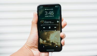
When you look at your favorite album or single, what’s the first thing you notice? It’s the music cover page design! This small but powerful piece of art grabs attention, tells a story, and sets the vibe for your music. Whether you’re a new artist or have been in the game for years, your cover design is your first chance to make an impression.
Think of your music cover as your shop window. If it looks amazing, people will stop and take a look—or, in this case, hit “play.” Let’s dive into how you can make a stunning cover that speaks for your music.
What is a Music Cover Page?
A music cover page is the image or artwork that represents your song, album, or EP. It shows up everywhere your music does—Spotify, Apple Music, YouTube, and even on CDs or vinyl. It’s a mix of visuals and text that tells your audience, “This is what my music feels like.”
Why a Great Music Cover Page Design Matters
Your music might be the next big thing, but if your cover design is dull, people might not even give it a chance. Here’s why your cover page matters so much:
- First Impressions Count: Before anyone listens to your music, they’ll see the cover. A striking design makes them curious.
- Reflects Your Style: Your music cover tells people who you are. Are you bold, dreamy, or edgy? Show it in your design!
- Marketing Power: Covers are shared on social media, playlists, and stores. A great cover makes people click.
What Makes a Good Music Cover Page?
To make a good cover, you don’t need to be a professional designer. You just need to keep a few simple things in mind:
1. Keep It Simple
- Don’t overcrowd your design. Less is often more!
- Choose one or two focal points like an image, logo, or bold text.
2. Pick the Right Colors
- Use colors that match the mood of your music. Bright colors for happy songs, dark shades for emotional tracks.
3. Use High-Quality Images
- Always use sharp and clear images. A blurry cover looks unprofessional.
4. Include Your Artist Name and Song Title
- Make sure the text is easy to read.
Step-by-Step Guide to Designing a Music Cover Page
Now let’s make your cover page in a few easy steps!
Step 1: Decide on a Theme
Think about your song or album. Is it happy, sad, romantic, or energetic? Your theme should match the feeling of your music.
Step 2: Choose Your Tools
You don’t need expensive software. Use free tools like:
- Canva: Perfect for beginners with lots of templates.
- Adobe Express: Easy to use and professional-looking.
If you want more advanced tools:
- Photoshop: Great for detailed designs.
- Procreate: Ideal for artists who love to draw.
Step 3: Select Images and Colors
You can use your own photo or find free ones on websites like Unsplash or Pexels. Match your color palette to your theme.
Step 4: Add Text
Write your song title and your artist name. Use clean, easy-to-read fonts.
Step 5: Review and Save
Before you finish, zoom out to see how it looks from a distance. Save it in high resolution (3000 x 3000 pixels).
Tips for Making Your Music Cover Stand Out
- Make it Memorable: Think about covers you’ve loved. What made them stand out? Use that inspiration.
- Stay True to Your Brand: Your design should match your style. If you’re a pop artist, go for fun, bold designs. For indie music, try soft, artsy vibes.
- Test with Friends: Show your cover to a few people and ask for honest feedback.
Mistakes to Avoid
Even small mistakes can ruin a great design. Watch out for these common issues:
- Too Much Text: Keep the text short and sweet.
- Low-Quality Images: Always use sharp images that look professional.
- Complicated Fonts: Avoid hard-to-read fonts.
Trends in Music Cover Page Design (2024)
Staying trendy doesn’t mean losing your originality. Here are some popular styles for music covers:
- Minimalist Designs: Simple and clean.
- Retro Vibes: Bright colors, funky patterns.
- Hand-Drawn Art: A personal touch that feels authentic.
- Bold Text: Make your title pop.
Real-Life Inspiration: Iconic Music Covers
Learning from the best can help you craft your own masterpiece. Here are a few examples:
- Drake’s “Nothing Was the Same”: Simple but bold.
- Adele’s “25”: Close-up and emotional.
- The Beatles’ “Abbey Road”: A timeless classic.
How Deliver My Tune Can Help You Shine
At Deliver My Tune, we’re here to support your music journey. From helping with music distribution to designing your perfect cover, we’ve got your back.
What We Offer:
- AI Mastering: Make your tracks sound perfect.
- Artist Portfolio: Showcase your work professionally.
- Social Media Management: Get your music noticed.
Frequently Asked Questions (FAQs)
1. What Size Should My Music Cover Be?
Most platforms recommend 3000 x 3000 pixels. It should be square and high resolution.
2. Can I Use Any Image for My Cover?
Make sure the image is yours or royalty-free. Avoid copyrighted material unless you have permission.
3. How Do I Match My Cover to My Song?
Think about the emotions in your music. Use colors, fonts, and images that reflect those feelings.
Conclusion: Let Your Cover Speak for Your Music
Your music cover page design is more than just a pretty picture—it’s the face of your music. A great design can pull listeners in, tell your story, and make your tracks unforgettable.
So, take your time, have fun, and let your creativity shine. And if you need any help, Deliver My Tune is here to make your music journey easy and enjoyable.
Related Articles:
For further reading, explore these related articles:
- A Complete Guide to Understanding Your Spotify Account Overview
- Who is the Most Played Artist on Spotify?
For additional resources on music marketing and distribution, visit Deliver My Tune.


